


MedFriendly®


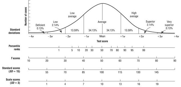
The graph to the right is a
visual depicition of the
bell curve where the
mean is the middle of the
curve. Increments to the
right and left of the mean
are standard deviations
and provide information
on how far below or
above a score is from the
mean. The farther a score
is from the mean, the
more atypical it is.
Psychologists and teachers commonly use these scores when describing test performance results. For
example, you may have heard of someone having an IQ score of 100. This called a standard score
because you can see that 100 is at the exact center of the curve. Z-scores, T scores, and scaled scores
express the same thing that standard scores do, but do so based on a different numerical system with
different means and standard deviation units as shown above. The percentage of people who score is
each standard deviation unit is noted in the bell curve above with % values.
The percentile rank allows you to determine an individual's position in relation to a sample of other
individuals. More specifically, the percentile rank is the point in a distribution at or below which the
scores of a given percentage of individuals fall. For example, a person with an IQ score of 120 (and a
percentile rank of 91) has scored as well or better than 91 percent of people in the normal sample. The
table below is intended for general usage by health care providers and the general public. For other
measurements, please visit the MedFriendly Measurements section.
| |
|||||
| |
|||||
| |
|||||
| |
|||||
| |
|||||
| |
|||||
| |
|||||
| |
|||||
| |
|||||
| |
|||||
| |
|||||
| |
|||||
| |
|||||
| |
|||||
| |
|||||
| |
|||||
| |
|||||
| |
|||||
| |
|||||
| |
|||||
| |
|||||
| |
|||||
| |
|||||
| |
|||||
| |
|||||
| |
|||||
| |
|||||
| |
|||||
| |
|||||
| |
|||||
| |
|||||
| |
|||||
| |
|||||
| |
|||||
| |
|||||
| |
|||||
| |
|||||
| |
|||||
| |
|||||
| |
|||||
| |
|||||
| |
|||||
| |
|||||
| |
"Where Medical Information is Easy to Understand"™

Standard Score to Percentile Conversion